Soyeon Yun
UX/UI
Other Work
About
Personalized Investing, Powered by AI
During I worked with Fingoo. This service was designed to solve key pain points of existing investment analysis apps by simplifying complex data and enabling easier decision-making through AI. The service significantly reduced investment research time and increased task completion rates, making investment more accessible for beginners. By streamlining complex charts into intuitive summaries, Fingoo unlocked market potential by helping novice investors gain confidence and take action.
Year
Company
2025
Fingoo
OS
Role
App, Web
Product Designer (100%)
Problem Finding 01
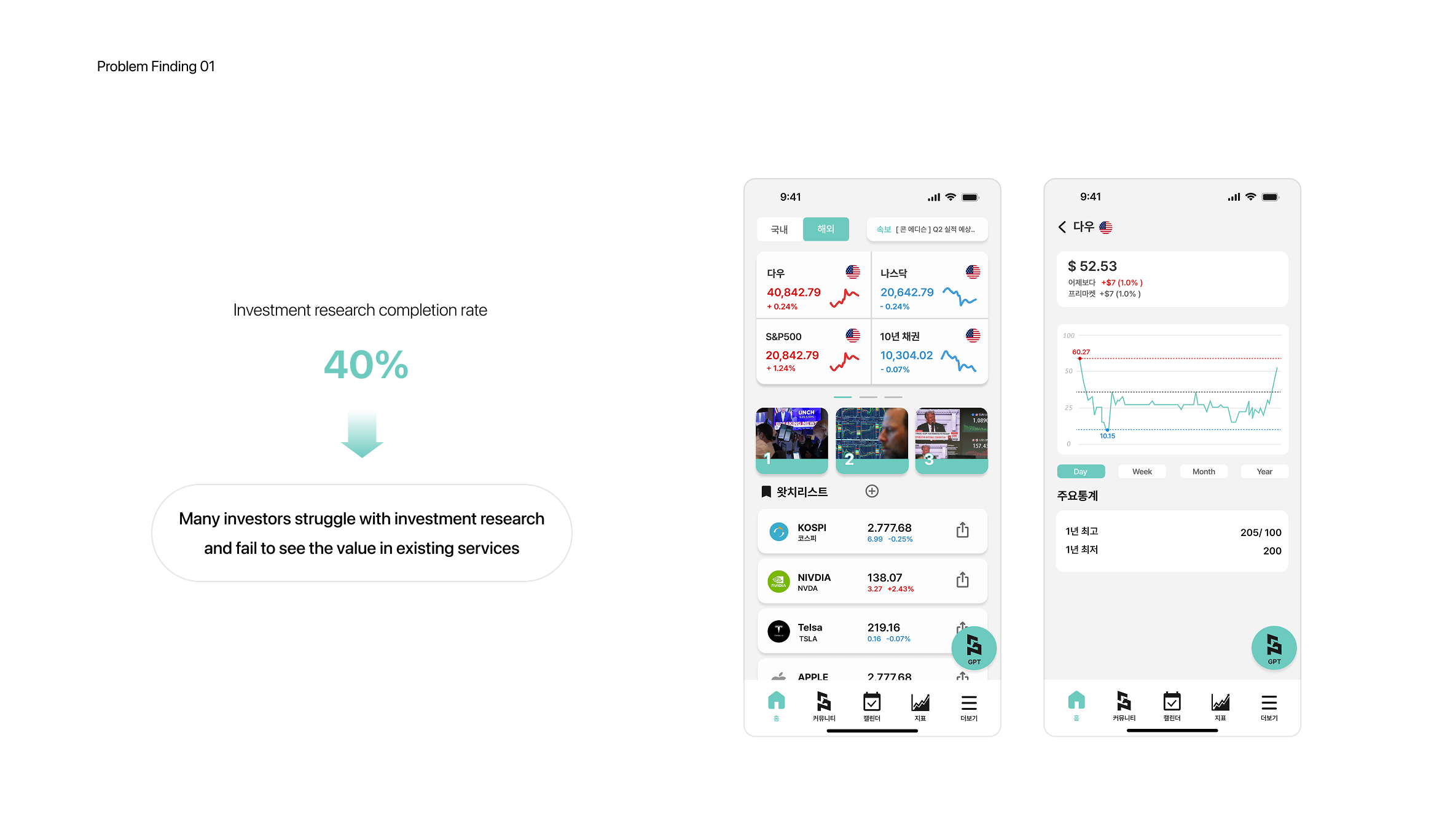
Identified low satisfaction among investors due to poor completion rates in investment research tasks.
Usability testing revealed that beginner investors struggled to complete research tasks efficiently, resulting in low task completion rates and prolonged research times. Despite our goal of simplifying investment research, many users abandoned the process midway due to cognitive overload and unclear next steps. This friction directly impacted user satisfaction and undermined the core value of accessibility. To address this, we identified key blockers in the research flow and prioritized a usability-focused redesign
Problem Finding 02
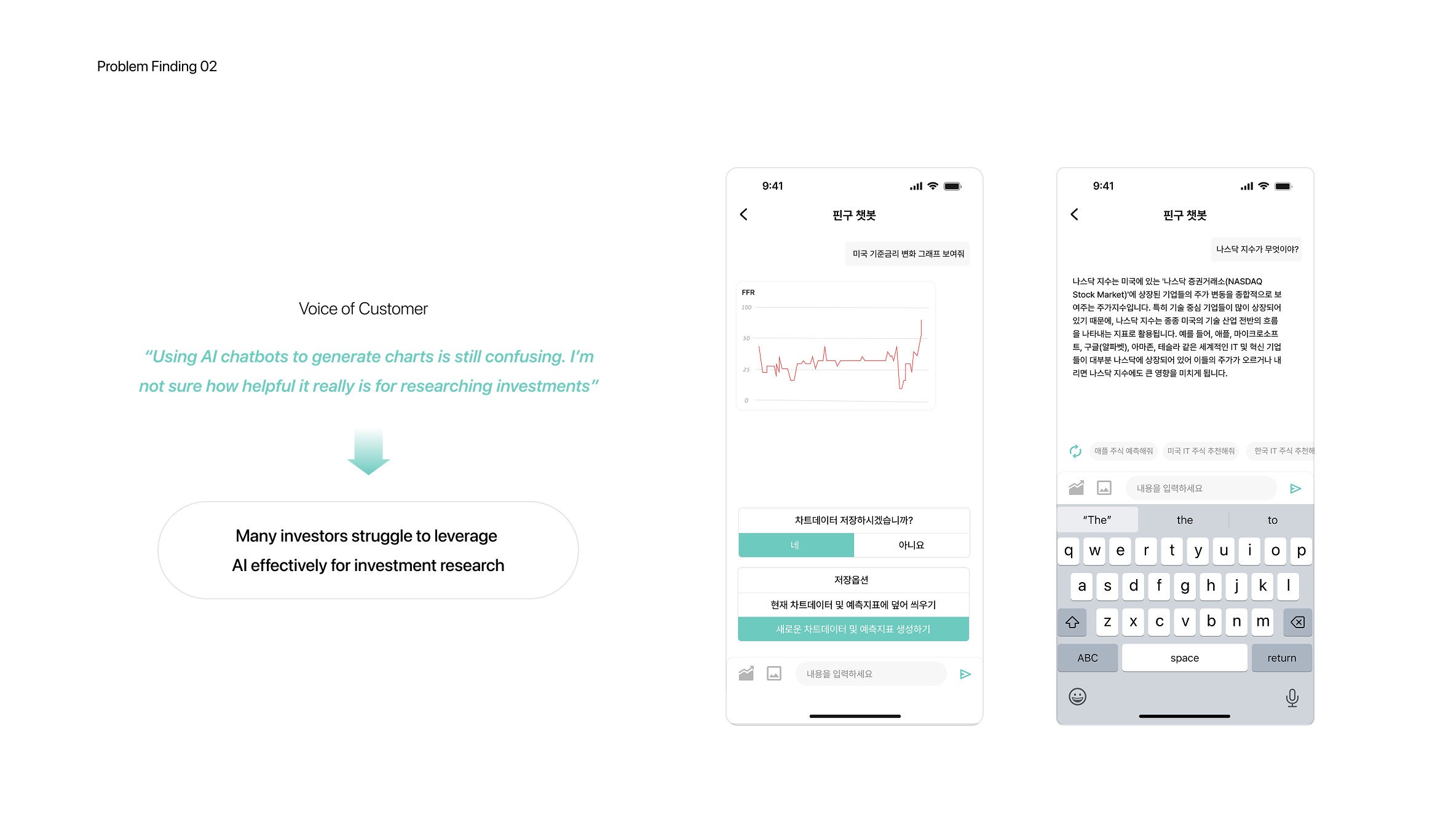
User-unfriendly AI feature
During usability testing, we observed that users struggled with the AI-based chart generation flow. Although the feature allowed users to generate charts via the chatbot, they were forced to switch to a separate page for analysis, interrupting their task flow.
This break in continuity led to confusion and drop-off, especially among beginner investors. Given that seamless AI interaction was central to our product’s value proposition, we prioritized a redesign to unify chart generation and analysis into a single, fluid experience
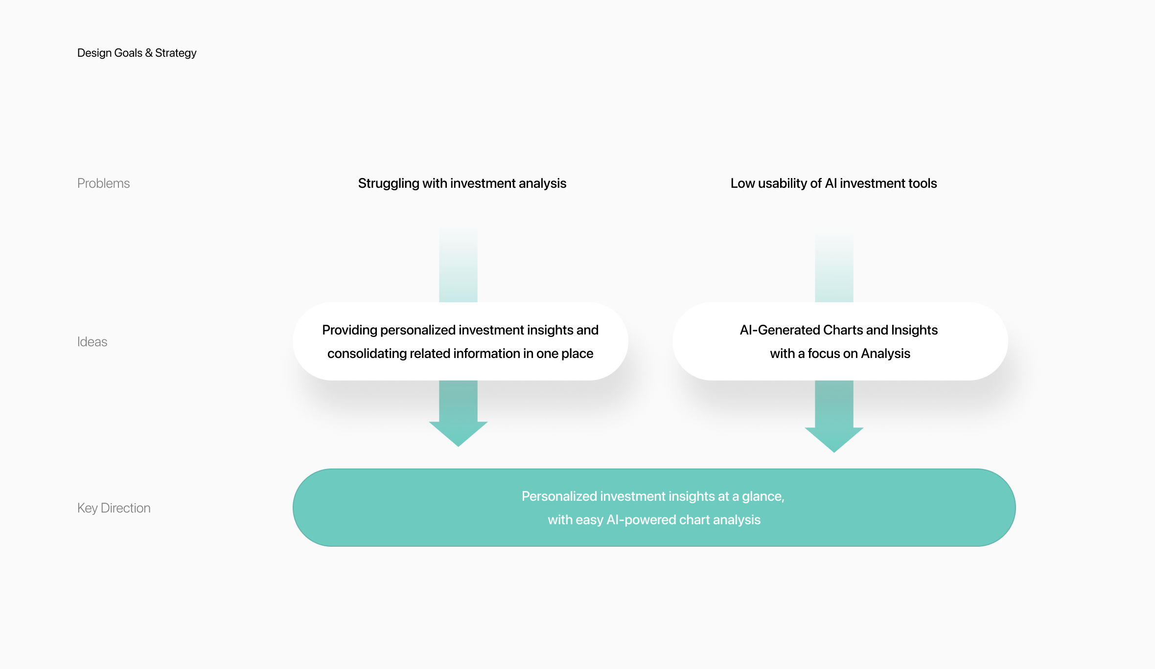
Design Goals & Strategy
Strategic Focus: Clarity, Personalization, and Seamless AI Interaction
To address the pain points uncovered during research, we set two design goals:
- Deliver clear, relevant insights.Both beginners and experienced investors struggled with scattered information. We prioritized concise, tailored insights to reduce cognitive load and boost decision-making confidence.
- Streamline AI interaction.Testing showed users preferred generating charts directly in the analysis interface rather than through a chatbot. We integrated AI into the chart flow to minimize friction and support seamless in-context analysis.
Together, these strategies transformed complex data into simple, actionable insights without overwhelming the user
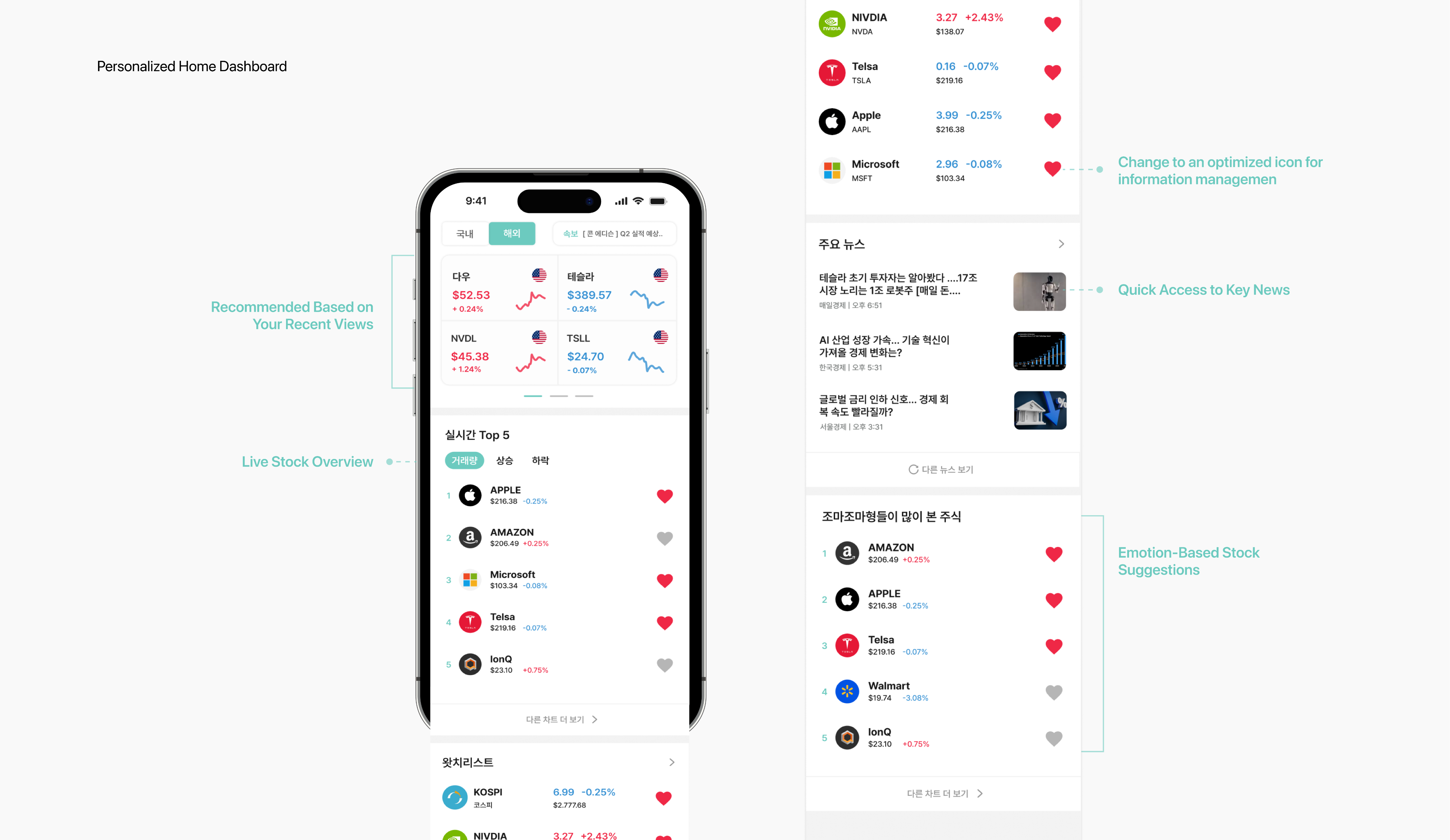
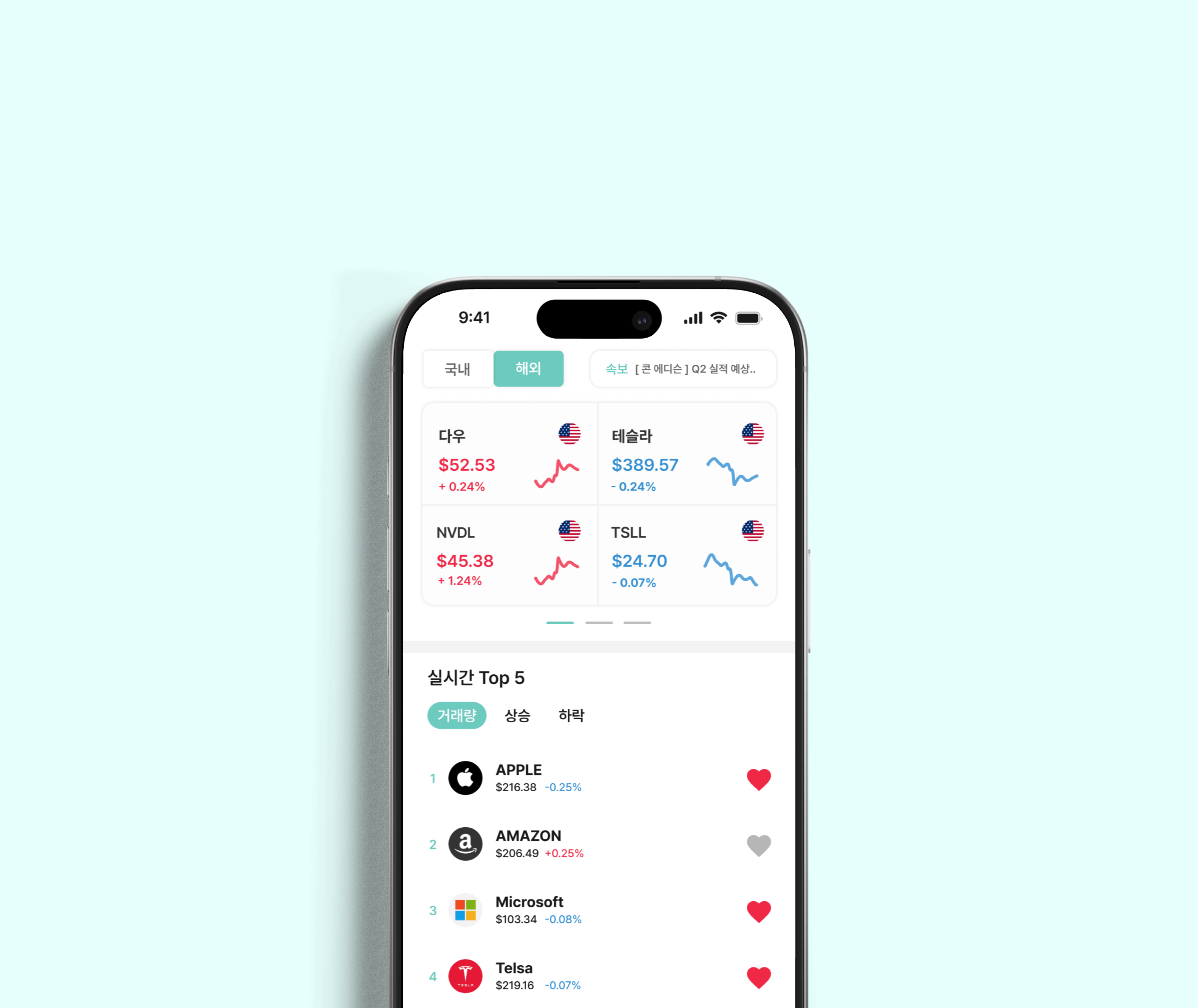
Personalized Home Dashboard
Personalized investement i
The original home screen surfaced generic and irrelevant information, making it difficult for users to quickly access what truly mattered.
We redesigned the experience to deliver tailored content based on individual behaviors and emotional investment styles.
The updated dashboard presents:
- Real-time stock summaries
- Personalized recommendations based on recently viewed stocks
- Suggestions aligned with each user’s emotional investment pattern
This shift not only reduced information overload, but also increased engagement by making the data feel more contextual, relevant, and actionable.

All related investment information at a glance
Bringing Fragmented Information Together
Our research showed that users felt overwhelmed by disjointed information, making it difficult to focus on investment priorities.
To solve this, we consolidated key data points into a single, intuitive dashboard—tailored to each user’s preferences.
Rather than forcing users to jump between pages, the redesigned interface surfaces relevant stock data, curated recommendations, and emotionally-aligned insights in one place.
This approach significantly reduced cognitive load, enabled faster decision-making, and helped users feel more confident in their next move.

A/B Testing
Users want not only chart analysis but also a concise view of investment insights
In the first round of usability testing with 15 participants, I discovered that 80% of users preferred generating charts directly within the chart interface rather than through a chatbot. Users also reported frustration with the previous chatbot-based design, which required over five steps to view generated chart data—resulting in inefficiency and friction.
To address this issue, I conducted an A/B test with 10 participants, comparing a layout that combined chatbot interaction with chart creation and analysis against a chart-analysis-focused layout. The results revealed that the final design direction should emphasize chart analysis while also providing concise investment insights
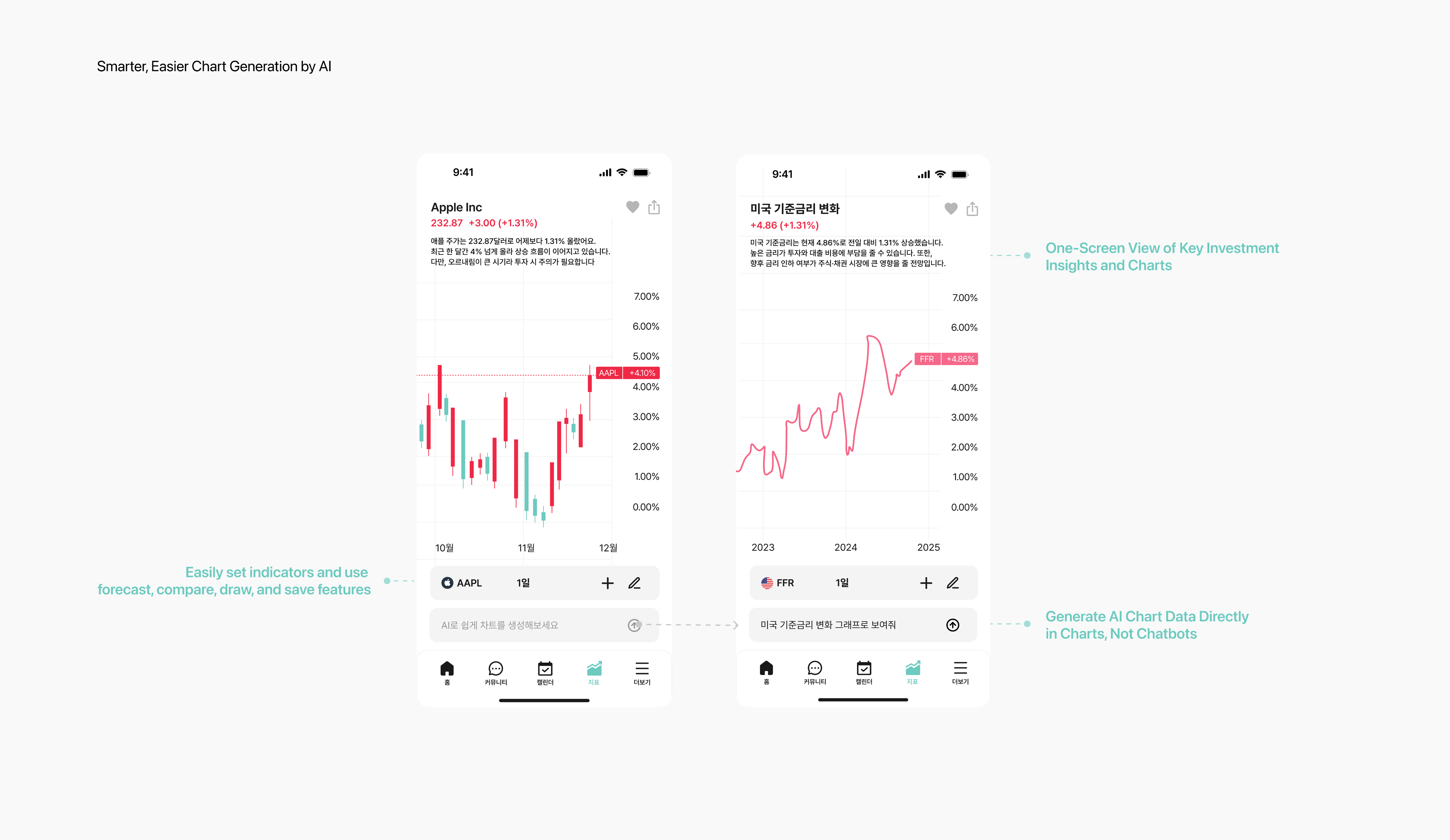
Smarter, Easier Chart Generation by AI
Users wanted AI-generated data directly in the chart with insights
After the A/B test, I found that analyzing charts within the chatbot was inconvenient due to the small chart area, and users had to scroll to view investment insights. However, I also identified a strong need for concise investment insight summaries during analysis.
By combining these pain points and user needs, we designed a chart-analysis-focused layout that integrates investment insights, ultimately enhancing the usability of the AI for investment analysis.
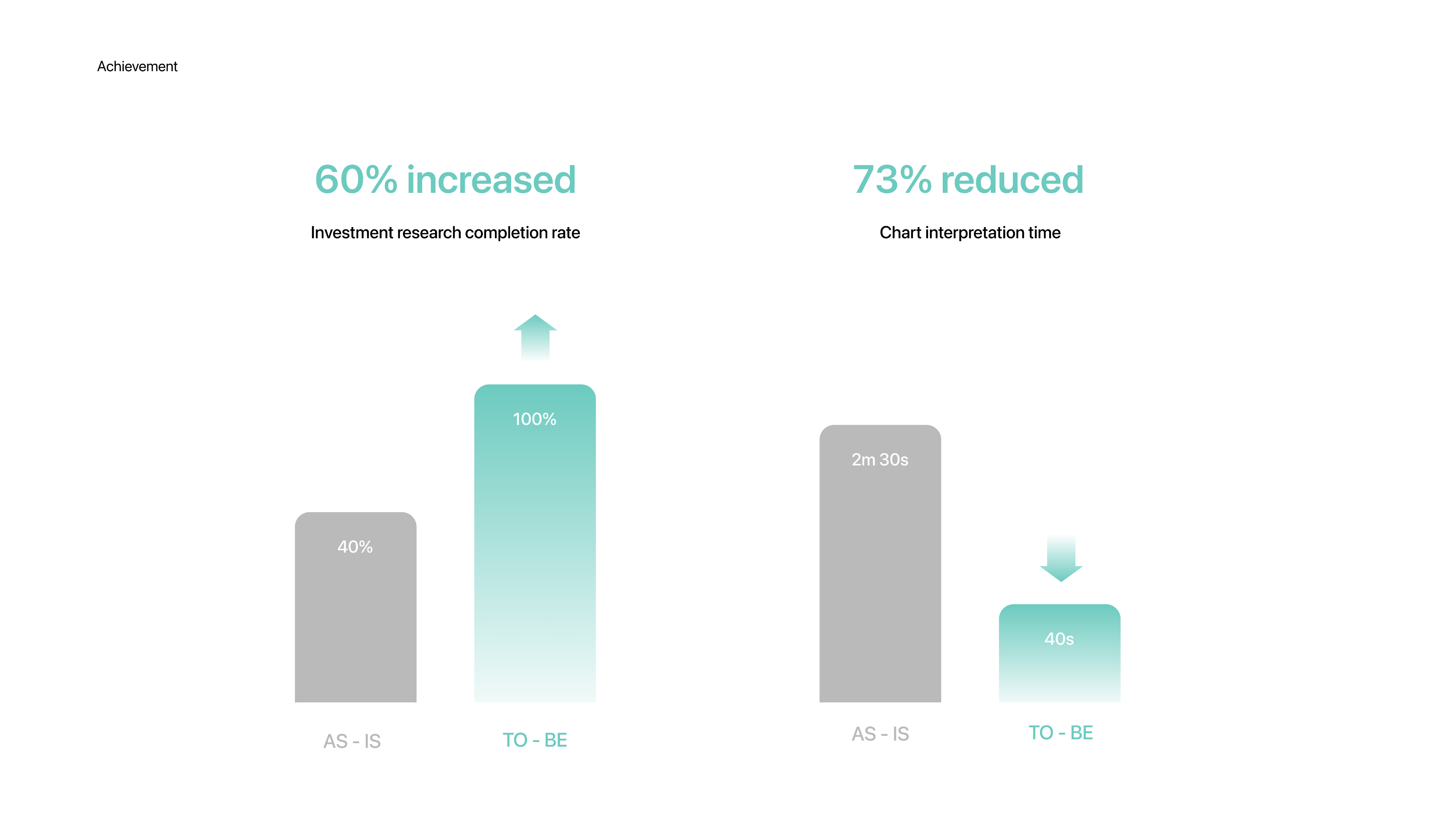
Achievement
73% Faster Chart Interpretation, 60%p Higher Completion Rate
After the redesign, we conducted second user testing with 15 investors in their 20s and 30s. Chart interpretation time dropped from 2 minutes 30 seconds to 40 seconds, and the completion rate rose from 40% to 100%. These improvements indicate a more intuitive user experience and the potential for increased engagement and retention.
What I learned
Always user test.Even features that feel intuitive to the designer can confuse real users. Our first version of the chatbot seemed seamless—until testers abandoned it halfway. That moment reminded me: usability isn't a feeling. It's feedback.
Nothing is obvious.We assumed users wanted charts integrated into the chatbot experience. But in reality, what they needed was clarity—clear entry points, digestible visuals, and minimal friction.This experience reminded me that good design isn't about delivering more features, but about understanding what truly reduces user effort. The space between assumption and reality is where meaningful design begins.
Design isn't decoration.Our goal wasn’t to make things look good—it was to help users feel calm, clear, and in control when navigating complex information.Visual simplicity was not the end, but a means to build user trust and understandin
Team member
CEO 1, CTO 1, Product Designer 1, Developer Team 4, Marketing Team 3
My Role
I led the full design process individually—from UX research and user testing to wireframes, high-fidelity UI design, and interactive prototyping.
Prototype
Prototype Video

Previous Project
Shinhan Foundation
Next Project

Hyundai Autoever Web
82 + 010 4657 2274
Email: soyeony@umich.edu
© Soyeon Yun 2025 All Rights Reserved
Personalized Investing, Powered by AI
During I worked with Fingoo. This service was designed to solve key pain points of existing investment analysis apps by simplifying complex data and enabling easier decision-making through AI. The service significantly reduced investment research time and increased task completion rates, making investment more accessible for beginners. By streamlining complex charts into intuitive summaries, Fingoo unlocked market potential by helping novice investors gain confidence and take action.
Year
Company
2025
Fingoo
OS
Role
App, Web
Product Designer (100%)
Problem Finding 01
Identified low satisfaction among investors due to poor completion rates in investment research tasks.
Usability testing revealed that beginner investors struggled to complete research tasks efficiently, resulting in low task completion rates and prolonged research times. Despite our goal of simplifying investment research, many users abandoned the process midway due to cognitive overload and unclear next steps. This friction directly impacted user satisfaction and undermined the core value of accessibility. To address this, we identified key blockers in the research flow and prioritized a usability-focused redesign
Problem Finding 02
User-unfriendly AI feature
During usability testing, we observed that users struggled with the AI-based chart generation flow. Although the feature allowed users to generate charts via the chatbot, they were forced to switch to a separate page for analysis, interrupting their task flow.
This break in continuity led to confusion and drop-off, especially among beginner investors. Given that seamless AI interaction was central to our product’s value proposition, we prioritized a redesign to unify chart generation and analysis into a single, fluid experience
Design Goals & Strategy
Strategic Focus: Clarity, Personalization, and Seamless AI Interaction
To address the pain points uncovered during research, we set two design goals:
- Deliver clear, relevant insights.Both beginners and experienced investors struggled with scattered information. We prioritized concise, tailored insights to reduce cognitive load and boost decision-making confidence.
- Streamline AI interaction.Testing showed users preferred generating charts directly in the analysis interface rather than through a chatbot. We integrated AI into the chart flow to minimize friction and support seamless in-context analysis.
Together, these strategies transformed complex data into simple, actionable insights without overwhelming the user
Personalized Home Dashboard
Personalized investement i
The original home screen surfaced generic and irrelevant information, making it difficult for users to quickly access what truly mattered.
We redesigned the experience to deliver tailored content based on individual behaviors and emotional investment styles.
The updated dashboard presents:
- Real-time stock summaries
- Personalized recommendations based on recently viewed stocks
- Suggestions aligned with each user’s emotional investment pattern
This shift not only reduced information overload, but also increased engagement by making the data feel more contextual, relevant, and actionable.
All related investment information at a glance
Bringing Fragmented Information Together
Our research showed that users felt overwhelmed by disjointed information, making it difficult to focus on investment priorities.
To solve this, we consolidated key data points into a single, intuitive dashboard—tailored to each user’s preferences.
Rather than forcing users to jump between pages, the redesigned interface surfaces relevant stock data, curated recommendations, and emotionally-aligned insights in one place.
This approach significantly reduced cognitive load, enabled faster decision-making, and helped users feel more confident in their next move.
A/B Testing
Users want not only chart analysis but also a concise view of investment insights
In the first round of usability testing with 15 participants, I discovered that 80% of users preferred generating charts directly within the chart interface rather than through a chatbot. Users also reported frustration with the previous chatbot-based design, which required over five steps to view generated chart data—resulting in inefficiency and friction.
To address this issue, I conducted an A/B test with 10 participants, comparing a layout that combined chatbot interaction with chart creation and analysis against a chart-analysis-focused layout. The results revealed that the final design direction should emphasize chart analysis while also providing concise investment insights
Smarter, Easier Chart Generation by AI
Users wanted AI-generated data directly in the chart with insights
After the A/B test, I found that analyzing charts within the chatbot was inconvenient due to the small chart area, and users had to scroll to view investment insights. However, I also identified a strong need for concise investment insight summaries during analysis.
By combining these pain points and user needs, we designed a chart-analysis-focused layout that integrates investment insights, ultimately enhancing the usability of the AI for investment analysis.
Achievement
73% Faster Chart Interpretation, 60%p Higher Completion Rate
After the redesign, we conducted second user testing with 15 investors in their 20s and 30s. Chart interpretation time dropped from 2 minutes 30 seconds to 40 seconds, and the completion rate rose from 40% to 100%. These improvements indicate a more intuitive user experience and the potential for increased engagement and retention.
What I learned
Always user test.Even features that feel intuitive to the designer can confuse real users. Our first version of the chatbot seemed seamless—until testers abandoned it halfway. That moment reminded me: usability isn't a feeling. It's feedback.
Nothing is obvious.We assumed users wanted charts integrated into the chatbot experience. But in reality, what they needed was clarity—clear entry points, digestible visuals, and minimal friction.This experience reminded me that good design isn't about delivering more features, but about understanding what truly reduces user effort. The space between assumption and reality is where meaningful design begins.
Design isn't decoration.Our goal wasn’t to make things look good—it was to help users feel calm, clear, and in control when navigating complex information.Visual simplicity was not the end, but a means to build user trust and understandin
Team member
CEO 1, CTO 1, Product Designer 1, Developer Team 4, Marketing Team 3
My Role
I led the full design process individually—from UX research and user testing to wireframes, high-fidelity UI design, and interactive prototyping.
Prototype
Prototype Video
Soyeon Yun
UX/UI
Other Work
About
Previous Project
Shinhan Foundation
Next Project
Hyundai Autoever Web
Email: soyeony@umich.edu
82 + 010 4657 2274
© Soyeon Yun 2025 All Rights Reserved
Personalized Investing, Powered by AI
During I worked with Fingoo. This service was designed to solve key pain points of existing investment analysis apps by simplifying complex data and enabling easier decision-making through AI. The service significantly reduced investment research time and increased task completion rates, making investment more accessible for beginners. By streamlining complex charts into intuitive summaries, Fingoo unlocked market potential by helping novice investors gain confidence and take action.
Year
Company
2025
Fingoo
OS
Role
App, Web
Product Designer (100%)
Problem Finding 01
Identified low satisfaction among investors due to poor completion rates in investment research tasks.
Usability testing revealed that beginner investors struggled to complete research tasks efficiently, resulting in low task completion rates and prolonged research times. Despite our goal of simplifying investment research, many users abandoned the process midway due to cognitive overload and unclear next steps. This friction directly impacted user satisfaction and undermined the core value of accessibility. To address this, we identified key blockers in the research flow and prioritized a usability-focused redesign
Problem Finding 02
User-unfriendly AI feature
During usability testing, we observed that users struggled with the AI-based chart generation flow. Although the feature allowed users to generate charts via the chatbot, they were forced to switch to a separate page for analysis, interrupting their task flow.
This break in continuity led to confusion and drop-off, especially among beginner investors. Given that seamless AI interaction was central to our product’s value proposition, we prioritized a redesign to unify chart generation and analysis into a single, fluid experience
Design Goals & Strategy
Strategic Focus: Clarity, Personalization, and Seamless AI Interaction
To address the pain points uncovered during research, we set two design goals:
- Deliver clear, relevant insights.Both beginners and experienced investors struggled with scattered information. We prioritized concise, tailored insights to reduce cognitive load and boost decision-making confidence.
- Streamline AI interaction.Testing showed users preferred generating charts directly in the analysis interface rather than through a chatbot. We integrated AI into the chart flow to minimize friction and support seamless in-context analysis.
Together, these strategies transformed complex data into simple, actionable insights without overwhelming the user
Personalized Home Dashboard
Tailored Information Delivered on the Home Screen
The original home screen surfaced generic and irrelevant information, making it difficult for users to quickly access what truly mattered.
We redesigned the experience to deliver tailored content based on individual behaviors and emotional investment styles.
The updated dashboard presents:
- Real-time stock summaries
- Personalized recommendations based on recently viewed stocks
- Suggestions aligned with each user’s emotional investment pattern
This shift not only reduced information overload, but also increased engagement by making the data feel more contextual, relevant, and actionable.
All related investment information at a glance
Bringing Fragmented Information Together
Our research showed that users felt overwhelmed by disjointed information, making it difficult to focus on investment priorities.
To solve this, we consolidated key data points into a single, intuitive dashboard—tailored to each user’s preferences.
Rather than forcing users to jump between pages, the redesigned interface surfaces relevant stock data, curated recommendations, and emotionally-aligned insights in one place.
This approach significantly reduced cognitive load, enabled faster decision-making, and helped users feel more confident in their next move.
A/B Testing
Users want not only chart analysis but also a concise view of investment insights
In the first round of usability testing with 15 participants, I discovered that 80% of users preferred generating charts directly within the chart interface rather than through a chatbot. Users also reported frustration with the previous chatbot-based design, which required over five steps to view generated chart data—resulting in inefficiency and friction.
To address this issue, I conducted an A/B test with 10 participants, comparing a layout that combined chatbot interaction with chart creation and analysis against a chart-analysis-focused layout. The results revealed that the final design direction should emphasize chart analysis while also providing concise investment insights
Smarter, Easier Chart Generation by AI
Users wanted AI-generated data directly in the chart with insights
After the A/B test, I found that analyzing charts within the chatbot was inconvenient due to the small chart area, and users had to scroll to view investment insights. However, I also identified a strong need for concise investment insight summaries during analysis.
By combining these pain points and user needs, we designed a chart-analysis-focused layout that integrates investment insights, ultimately enhancing the usability of the AI for investment analysis.
Achievement
73% Faster Chart Interpretation, 60%p Higher Completion Rate
After the redesign, we conducted second user testing with 15 investors in their 20s and 30s. Chart interpretation time dropped from 2 minutes 30 seconds to 40 seconds, and the completion rate rose from 40% to 100%. These improvements indicate a more intuitive user experience and the potential for increased engagement and retention.
What I learned
Always user test.Even features that feel intuitive to the designer can confuse real users. Our first version of the chatbot seemed seamless—until testers abandoned it halfway. That moment reminded me: usability isn't a feeling. It's feedback.
Nothing is obvious.We assumed users wanted charts integrated into the chatbot experience. But in reality, what they needed was clarity—clear entry points, digestible visuals, and minimal friction.This experience reminded me that good design isn't about delivering more features, but about understanding what truly reduces user effort. The space between assumption and reality is where meaningful design begins.
Design isn't decoration.Our goal wasn’t to make things look good—it was to help users feel calm, clear, and in control when navigating complex information.Visual simplicity was not the end, but a means to build user trust and understandin
Team member
CEO 1, CTO 1, Product Designer 1, Developer Team 4, Marketing Team 3
My Role
I led the full design process individually—from UX research and user testing to wireframes, high-fidelity UI design, and interactive prototyping.
Prototype
Prototype Video
Soyeon Yun
UX/UI
Other Work
About
Previous Project
Shinhan Foundation
Next Project
Hyundai Autoever Web
Email: soyeony@umich.edu
82 + 010 4657 2274
© Soyeon Yun 2025 All Rights Reserved