Soyeon Yun
UX/UI
Other Work
About
From Misclicks to Smooth Store Search
This project was a service planning initiative aimed at improving the sales location search experience on Kia’s website. It focused on resolving the unclear and inefficient user flow for finding sales locations, enhancing information satisfaction, and helping users reach the next step—requesting a purchase consultation—more quickly. Ultimately, the goal was to optimize the user journey to drive business benefits. This was a company task completed as part of the recruitment process.
Year
Company
2025
Hyundai Autoever
OS
Role
App, Web
Product Designer (100%)
Problem Findings
High Misclick Rate & Low Information Satisfaction in Sales Network Search
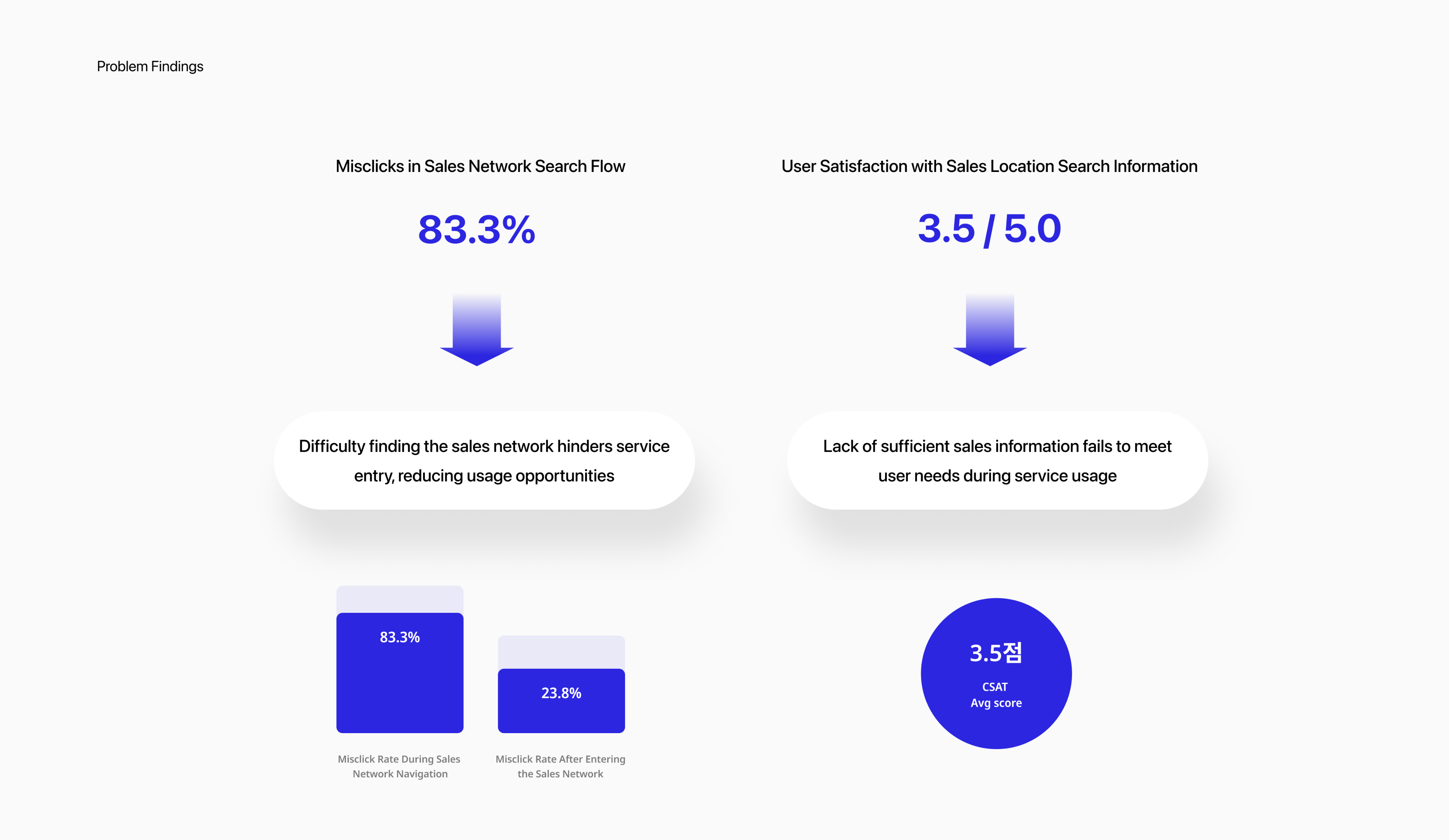
I conducted a prototype-based usability test with 8 users who had recently purchased or shown interest in cars, using Maze. I independently led the user research and surveys to identify usability issues in the sales network search experience.
The findings revealed two key problems:
- Users struggled to locate the sales network feature, resulting in a high rate of misclicks.
- Once inside the search flow, users were dissatisfied due to a lack of essential information.
These issues highlighted both navigation and information delivery problems, negatively impacting the overall user experience and service trust.
Soyeon Yun
UX/UI
Other Work
About
User Journey
Low Discoverability, Missing Info, and Broken Trust: Insights from the User Journey
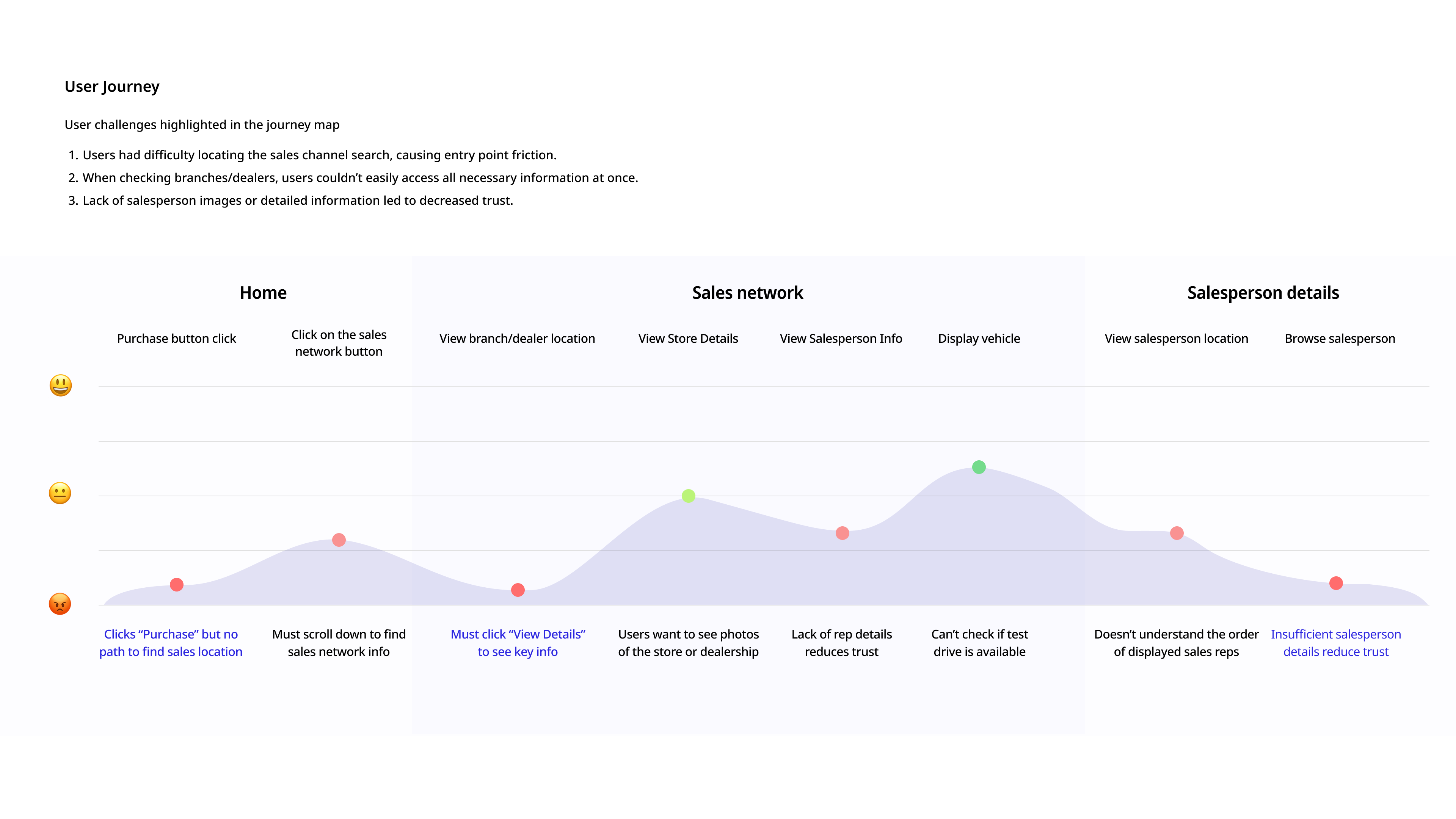
Building on insights gathered from user research, I created a user journey map to visualize the end-to-end experience and uncover deeper insights into user behavior. This approach allowed me to identify specific pain points at each stage of the journey, helping to translate abstract frustrations into clearly defined UX challenges.
As a result, I identified three critical issues that negatively impacted the overall user experience:
Low discoverability of the sales network search feature
Lack of consolidated information—such as vehicle availability and salesperson details—at a glance
Insufficient transparency in salesperson information, which reduced user trust and confidence in taking further action
User Research
Users wanted to see key information they considered important when browsing sales locations.
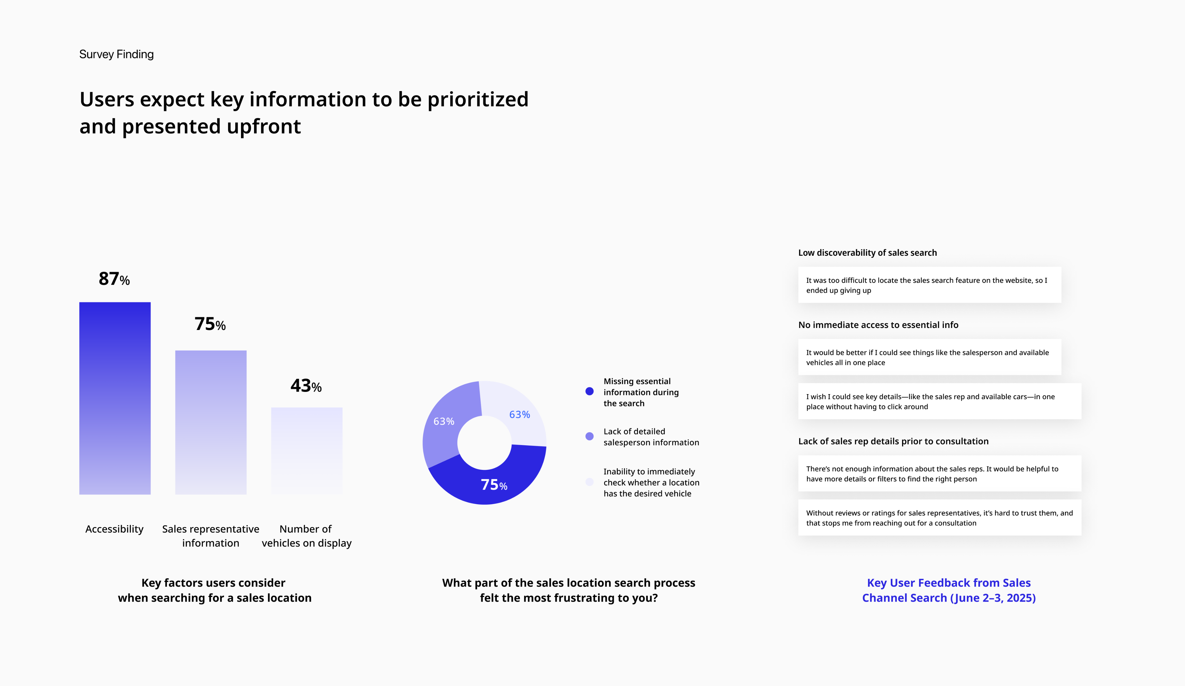
To further investigate the usability issues uncovered during testing, I conducted surveys and analyzed Voice of Customer (VOC) data to better understand users’ needs, frustrations, and expectations during the sales network search experience.
The research revealed that users prioritize three main aspects when browsing sales locations:
- Accessibility: Easily locating the sales search feature
- Transparency: Clear and trustworthy information about sales representatives
- Efficiency: Immediate visibility of which dealerships have the desired vehicles
However, the current interface failed to deliver on these expectations, resulting in usability issues such as low discoverability, fragmented information, and user frustration.
User Need: Users want key information presented up front, without extra steps or clicks.Pain Point: Users struggle to find the sales network search and cannot easily access critical information they care about.
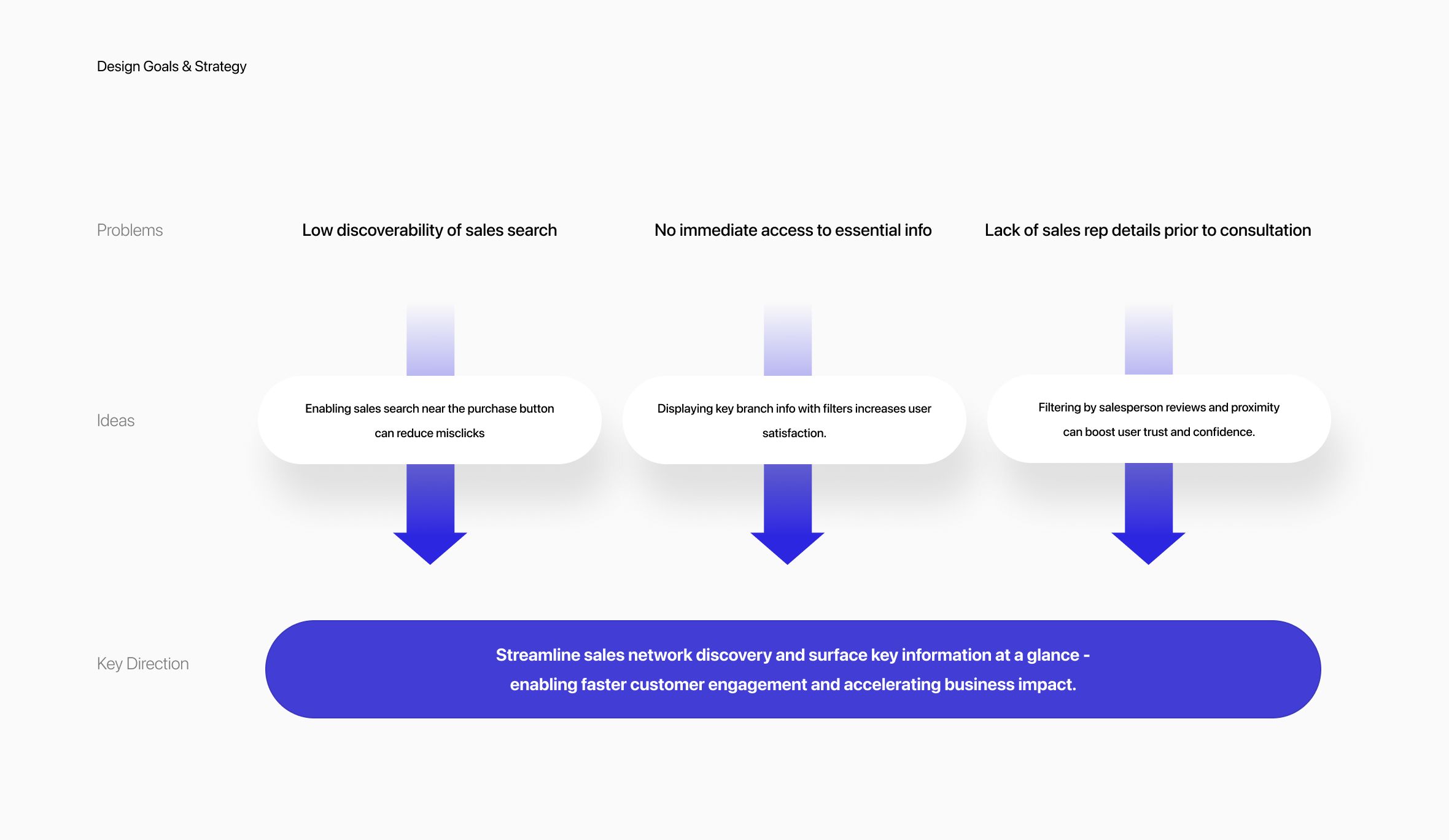
Design Goals & Strategy
Streamline sales network discovery and surface key information at a glance - enabling faster customer engagement and accelerating business impact.
Based on user research and journey mapping, we identified three critical pain points in the sales network experience:
- low visibility of the sales search feature,
- fragmented and hard-to-access information
- lack of trust due to missing salesperson details.
To address these, we explored UX ideas that would directly target each issue, such as repositioning key CTAs, enhancing filtering features, and creating concise info summaries.
We then unified these into a single design strategy:‘Streamline sales network discovery and surface key information at a glance to enable faster customer engagement and accelerate business impact.’
This strategy not only simplifies user flow but also empowers decision-making by delivering the most relevant information upfront.
Solution 1
No More Getting Lost: Find Sales in One Tap
To improve entry into the sales search experience, we redesigned the interface based on observed usability issues.After implementation and testing, misclick rates dropped by 48.0%, showing that the new layout reduced user confusion and improved accessibility.
Solutions:
- Direct access from the “Purchase” buttonLinked sales search directly to the high-traffic “Purchase” button, removing unnecessary guesswork and aligning with user behavior.
- Clearer labels for better understandingReplaced the vague label “Sales Network” with the more familiar “Sales Search” to improve clarity and reduce hesitation.
- Reduced scrolling for faster accessRelocated the sales search feature higher on the page, eliminating endless scrolling and surfacing key actions at a glance.
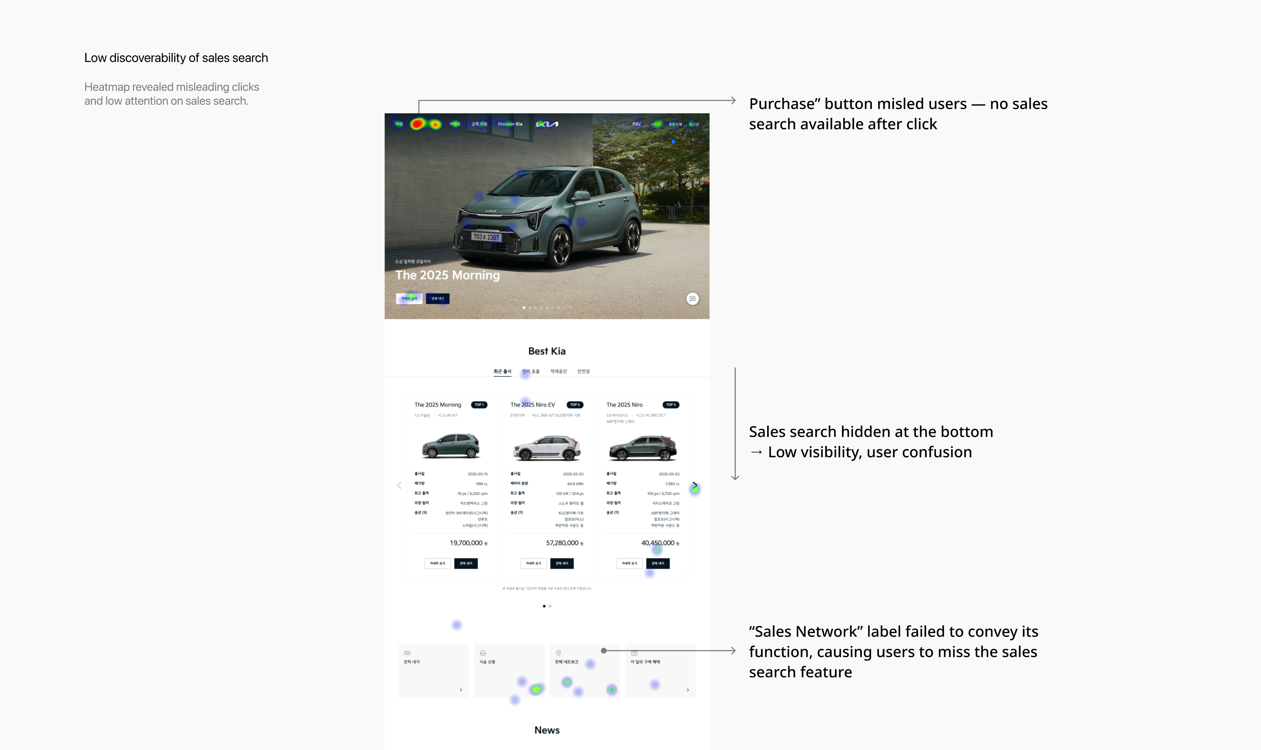
Low discoverability of sales search
Problem Statement 1
Usability testing revealed that several users struggled to complete a key task: finding a nearby sales location. Heatmap and click data confirmed frequent misclicks and navigation confusion, highlighting critical usability issues.
Problems:
- Misleading expectationsUsers clicked the “Purchase” button expecting to find sales locations. Since no such path existed, this caused confusion and drop-offs.
- Poor visual hierarchyThe sales search feature was buried at the bottom of the page, forcing unnecessary scrolling and reducing discoverability.
- Ambiguous labelingThe label “Sales Network” was unclear. Many users did not realize it referred to store locations, which delayed task completion
No immediate access to essential info
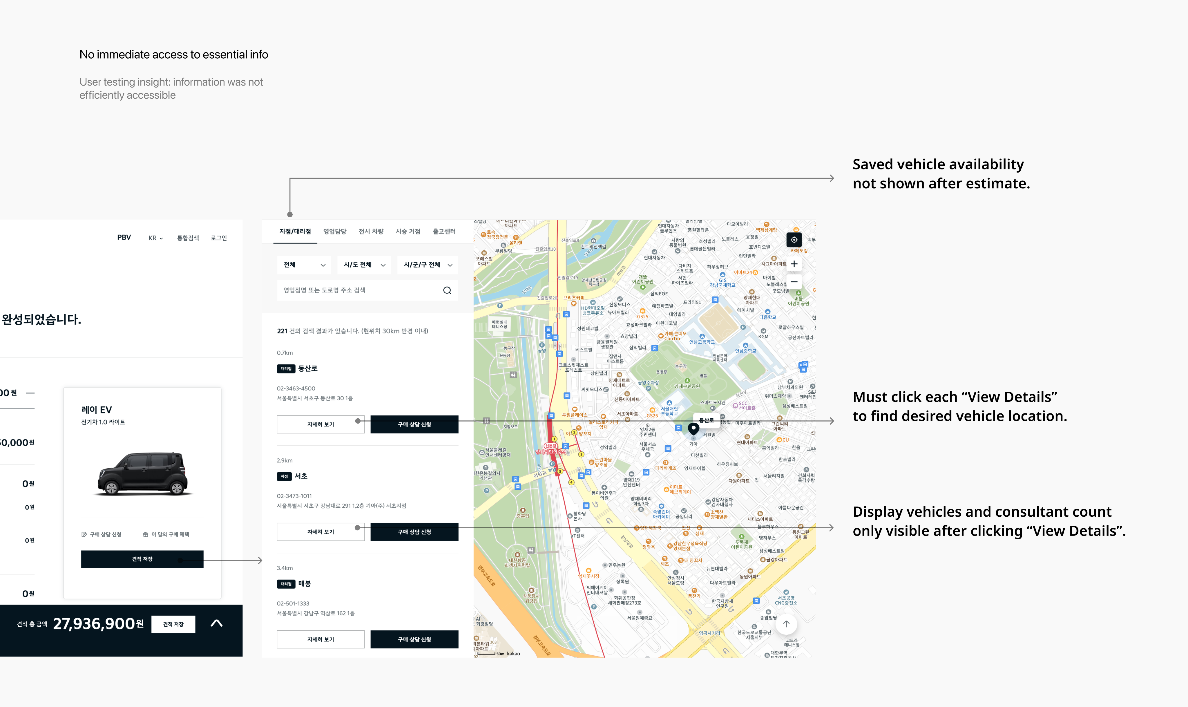
Problem Statement 2
Usability testing revealed that users often struggled to access key vehicle and branch details, causing frustration and task delays.
Problems:
- No visibility of saved vehicle availabilityAfter saving a vehicle via the estimate feature, users could not easily see which branches had it in stock. They had to repeat searches and manually cross-check locations, leading to duplicated effort.
- Inefficient branch comparisonUsers had to click “View Details” for each branch individually to check availability, turning the selection process into a slow, repetitive experience.
- Key decision-making info hidden behind clicksImportant information, such as display vehicle availability and the number of consultants, was only revealed after additional clicks, preventing quick and informed comparisons.
Solution 2
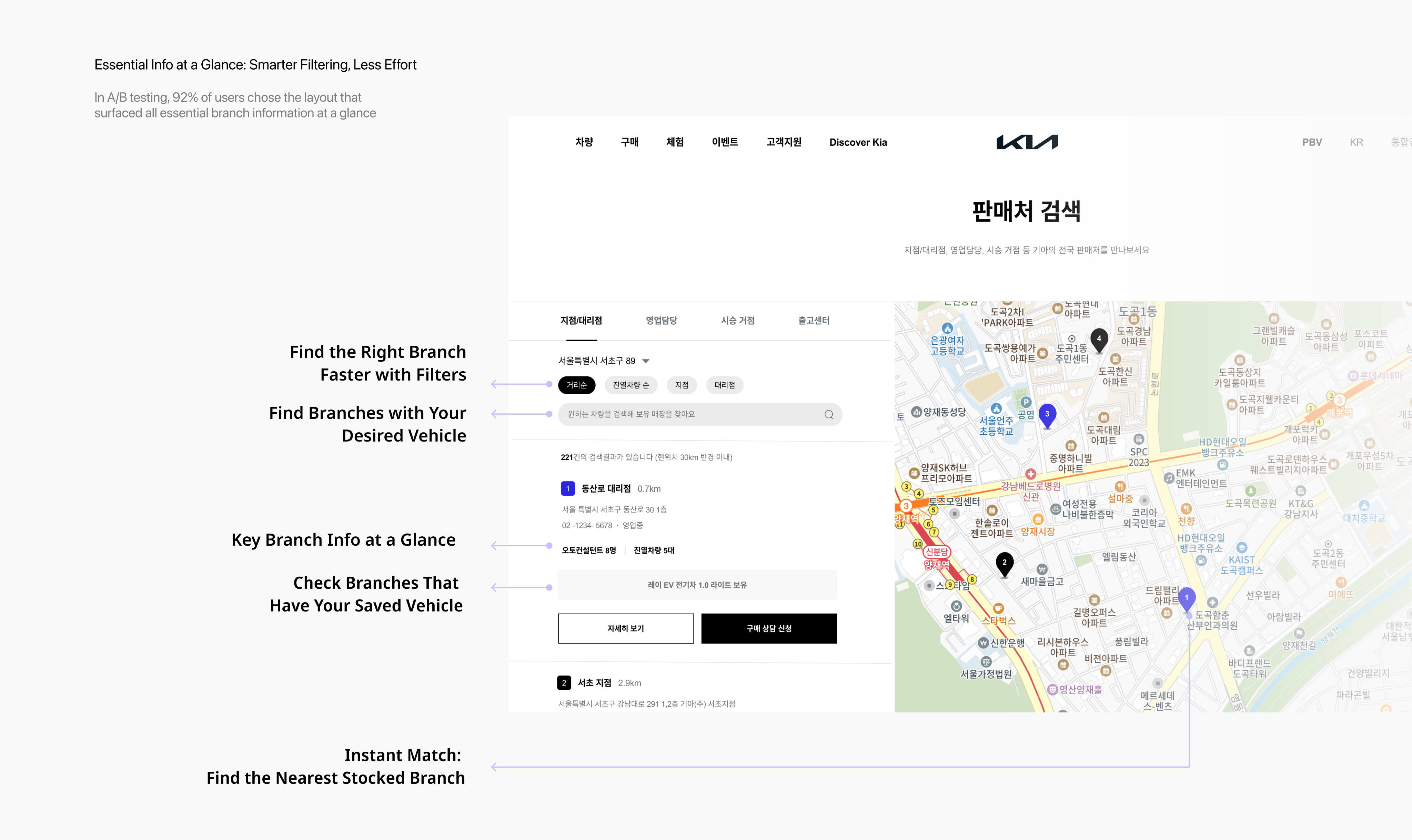
Essential Info at a Glance: Smarter Filtering, Less Effort
To address user frustration with scattered and hidden vehicle availability data, I redesigned the branch search interface to surface key details upfront. In A/B testing, 92% of users preferred the new layout, citing greater clarity and reduced search effort.
Solutions:
- Integrated saved vehicle data into search resultsUsers can now instantly see which branches carry their saved vehicle after estimating—eliminating the need to repeat searches or manually compare locations
- Exposed key branch information without extra clicksPreviously hidden data like vehicle count and number of consultants is now visible at a glance, allowing faster, more informed decisions.
- Added filter options for faster matchingUsers can filter branches by region, branch type, and vehicle model—helping them narrow down the list quickly and reduce cognitive load.
Lack of sales rep details prior to consultation
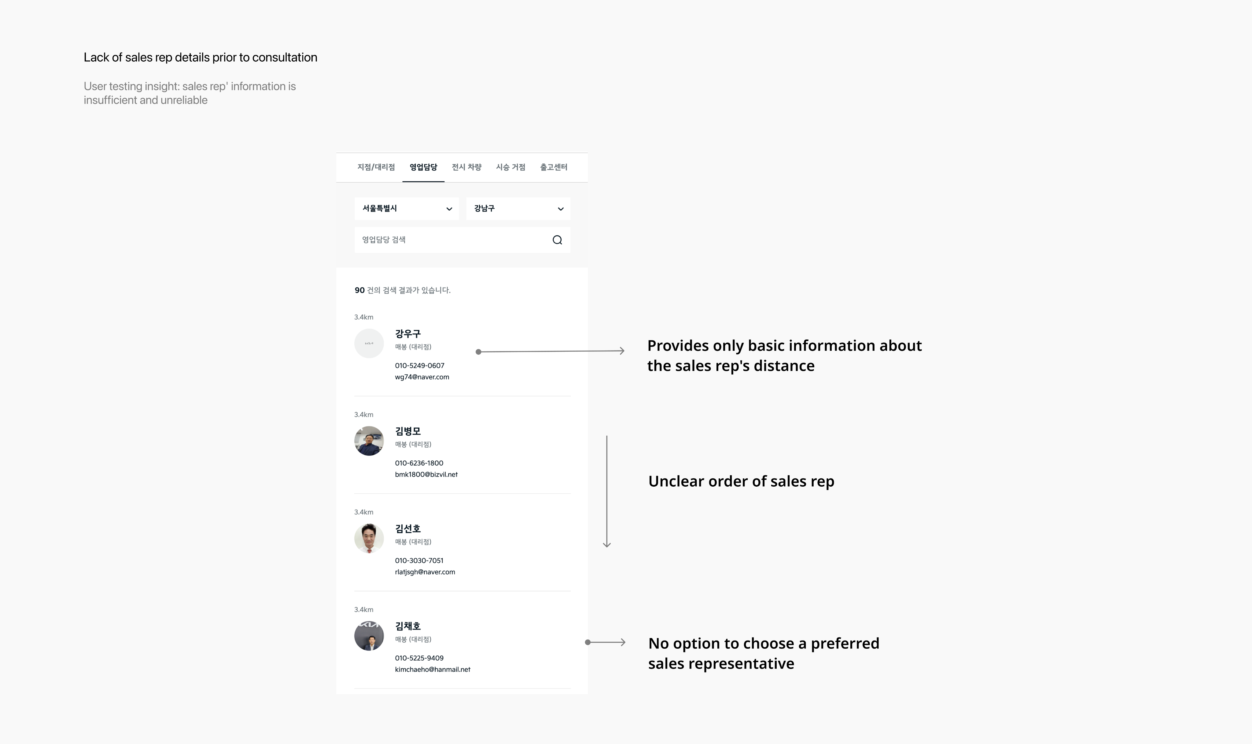
Problem Statement 3
After usability testing, I addressed user feedback and identified three main issues
Problems:
- Only basic sales rep information providedUsers could only see distance, without enough details to judge whether a consultant was trustworthy or suitable for their car needs.
- Unclear order of sales representativesAlthough nearby consultants were listed, the sorting logic was unclear, leaving users confused about the order.
- No option to choose a preferred sales representativeEven if users found a consultant they liked, they were unable to request a consultation with them, which led to drop-offs and canceled inquiries.
Solution 3
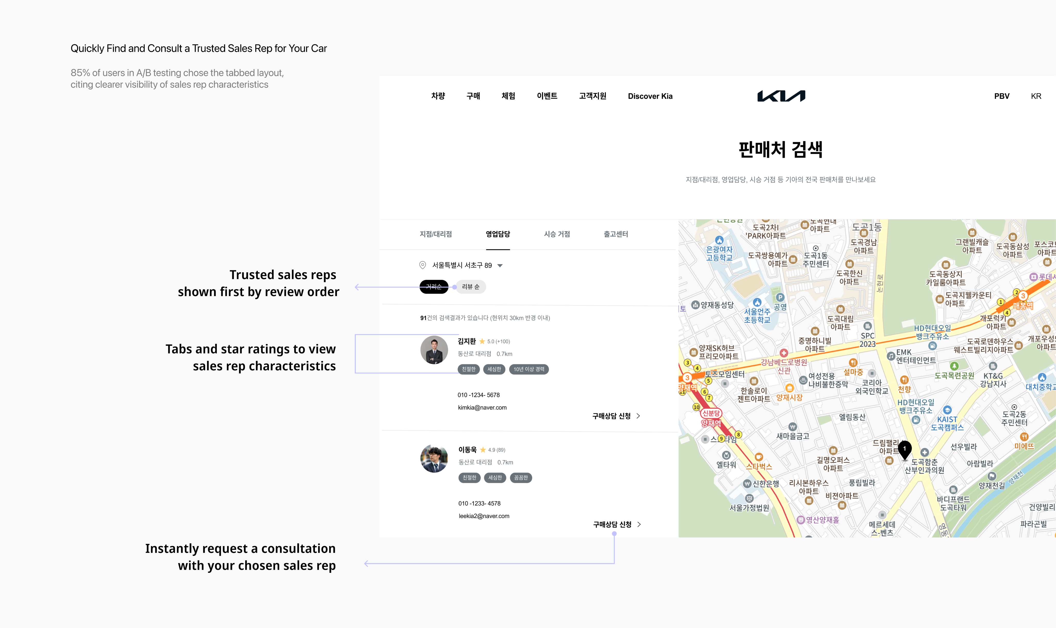
Quickly Find and Consult a Trusted Sales Rep for Your Car
To address user frustration with the lack of trustworthy information about sales representatives prior to consultation, I redesigned the sales rep section to provide clearer details. In A/B testing, 85% of users preferred a tab-based layout with key characteristics and ratings over long text introductions, citing greater clarity and efficiency in evaluating consultants
Solutions:
- Tabs and star ratings to view sales rep characteristicsThe original screen only displayed basic information about sales reps. We replaced this with a tab-based layout and star reviews, giving users a faster, more structured way to understand each consultant’s strengths. This increased user confidence in selecting a trustworthy representative
- Trusted reps shown first by review orderInstead of unclear sorting, sales reps are now displayed by review ranking. This transparency made it easier for users to identify top-rated consultants, improving both clarity and trust
- Instantly request a consultation with your chosen sales repIntroduced a direct consultation request option on the same page, allowing users to immediately connect with their preferred consultant. This not only increased consultation requests but also supported stronger sales conversions..
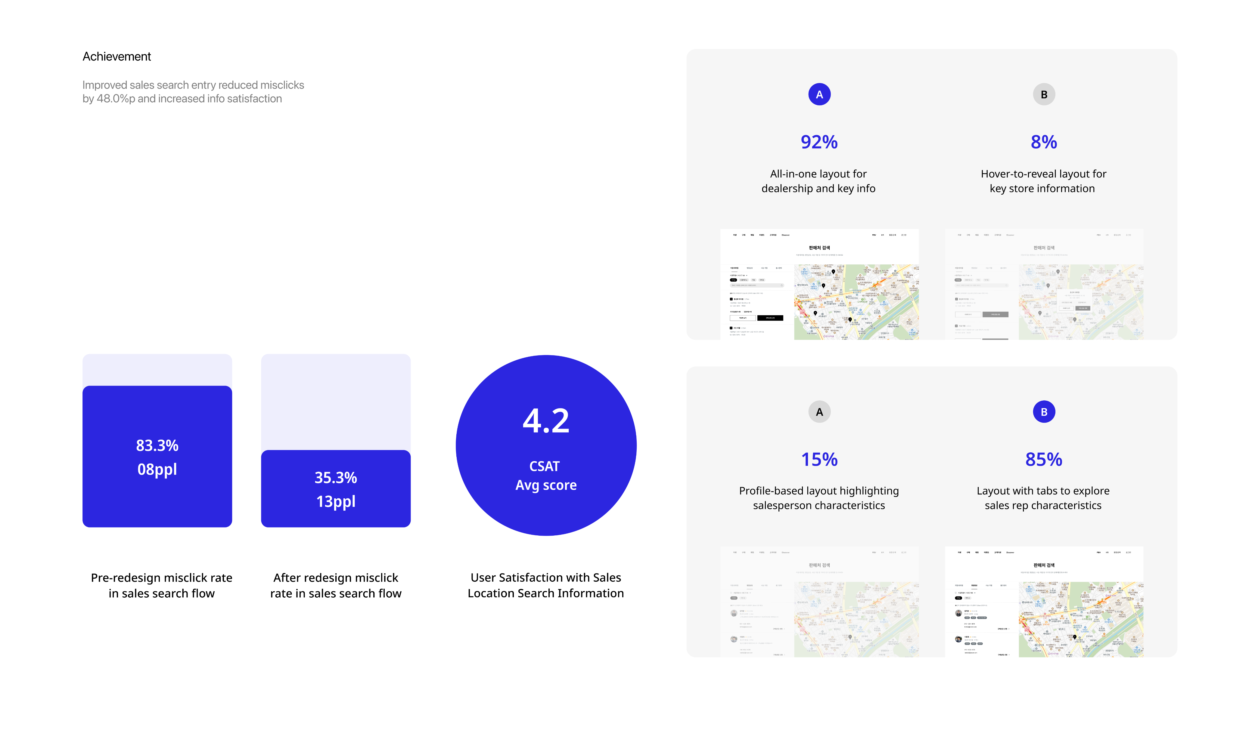
Achievement
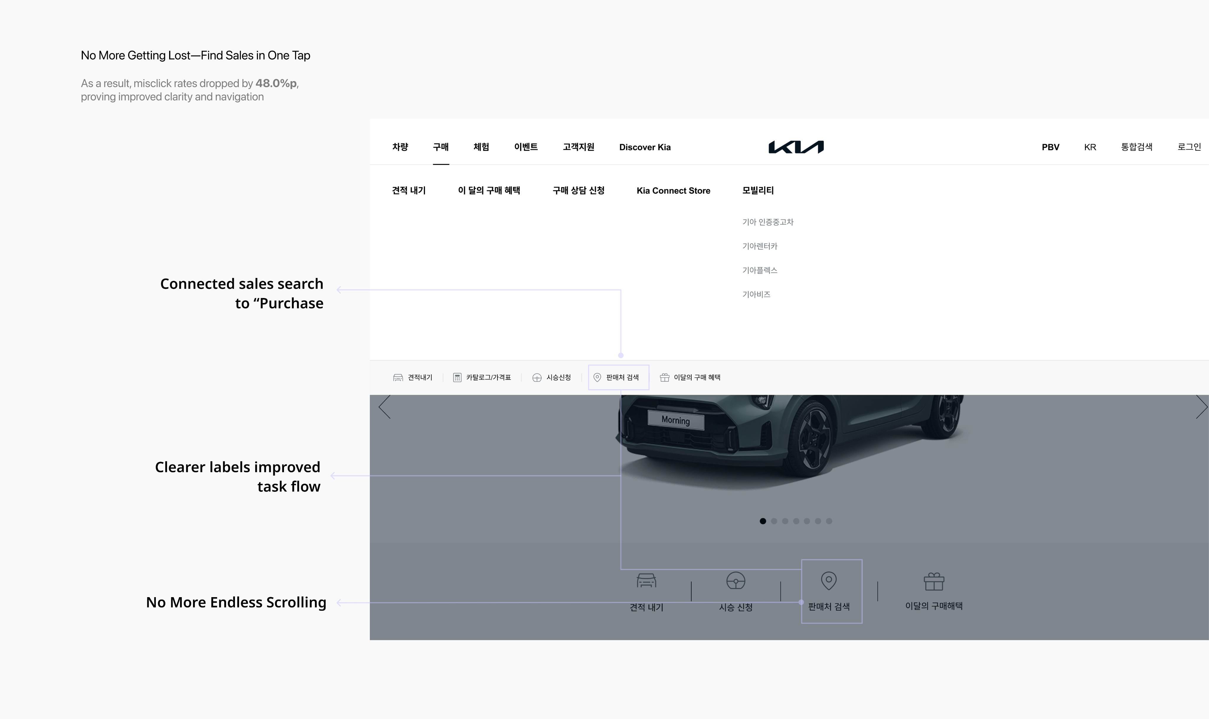
No More Getting Lost—Find Sales in One Tap
To improve entry into the sales search experience, we redesigned the interface based on observed usability issues. After implementation and testing, misclick rates dropped by 48.0%—indicating that the new layout helped reduce user confusion and improved accessibility.
Solutions:
- Connected sales search to the high-traffic “Purchase” button.
I linked the sales search directly to the “Purchase” button—removing unnecessary guesswork and aligning with user behavior. This change made access immediate and intuitive.
- Clearer labels improved task flow
I replaced the vague label “Sales Network” with the more familiar term “Sales Search,” improving user understanding and reducing hesitation during navigation.
- No more Endless scrolling
By relocating the sales search feature higher on the page, users no longer needed to scroll past unrelated content. Key actions became accessible at a glance.
What I learned
A/B testing is a step closer to usersThrough A/B testing, I learned to validate design decisions with evidence rather than assumptions. By comparing success rates across different layouts, I gained experience in measuring impact and using data-driven insights to guide iterative improvements.
Journey mapping is the key to understanding By creating journey maps, I learned to analyze the entire user flow instead of focusing on isolated screens. Mapping emotions alongside actions revealed hidden friction points and clarified opportunities, enabling me to design more intentional and human-centered solutions.
My Role
I led the full design process individually—from UX research and user testing to userflow, high-fidelity UI design, and interactive prototyping.
Prototype
Prototype Video

Previous Project
Fingoo
Next Project

Mingle
82 + 010 4657 2274
Email: soyeony@umich.edu
© Soyeon Yun 2025 All Rights Reserved
From Misclicks to Smooth Store Search
This project was a service planning initiative aimed at improving the sales location search experience on Kia’s website. It focused on resolving the unclear and inefficient user flow for finding sales locations, enhancing information satisfaction, and helping users reach the next step—requesting a purchase consultation—more quickly. Ultimately, the goal was to optimize the user journey to drive business benefits. This was a company task completed as part of the recruitment process.
Year
Company
2025
Hyundai Autoever
OS
Role
App, Web
Product Designer (100%)
Problem Findings
High Misclick Rate & Low Information Satisfaction in Sales Network Search
I conducted a prototype-based usability test with 8 users who had recently purchased or shown interest in cars, using Maze. I independently led the user research and surveys to identify usability issues in the sales network search experience.
The findings revealed two key problems:
- Users struggled to locate the sales network feature, resulting in a high rate of misclicks.
- Once inside the search flow, users were dissatisfied due to a lack of essential information.
These issues highlighted both navigation and information delivery problems, negatively impacting the overall user experience and service trust.
User Research
Users wanted to see key information they considered important when browsing sales locations.
To further investigate the usability issues uncovered during testing, I conducted surveys and analyzed Voice of Customer (VOC) data to better understand users’ needs, frustrations, and expectations during the sales network search experience.
The research revealed that users prioritize three main aspects when browsing sales locations:
- Accessibility: Easily locating the sales search feature
- Transparency: Clear and trustworthy information about sales representatives
- Efficiency: Immediate visibility of which dealerships have the desired vehicles
However, the current interface failed to deliver on these expectations, resulting in usability issues such as low discoverability, fragmented information, and user frustration.
User Need: Users want key information presented up front, without extra steps or clicks.Pain Point: Users struggle to find the sales network search and cannot easily access critical information they care about.
User Journey
Low Discoverability, Missing Info, and Broken Trust: Insights from the User Journey
Building on insights gathered from user research, I created a user journey map to visualize the end-to-end experience and uncover deeper insights into user behavior. This approach allowed me to identify specific pain points at each stage of the journey, helping to translate abstract frustrations into clearly defined UX challenges.
As a result, I identified three critical issues that negatively impacted the overall user experience:
Low discoverability of the sales network search feature
Lack of consolidated information—such as vehicle availability and salesperson details—at a glance
Insufficient transparency in salesperson information, which reduced user trust and confidence in taking further action
Soyeon Yun
UX/UI
Other Work
About
Design Goals & Strategy
Streamline sales network discovery and surface key information at a glance - enabling faster customer engagement and accelerating business impact.
Based on user research and journey mapping, we identified three critical pain points in the sales network experience:
- low visibility of the sales search feature,
- fragmented and hard-to-access information
- lack of trust due to missing salesperson details.
To address these, we explored UX ideas that would directly target each issue, such as repositioning key CTAs, enhancing filtering features, and creating concise info summaries.
We then unified these into a single design strategy:‘Streamline sales network discovery and surface key information at a glance to enable faster customer engagement and accelerate business impact.’
This strategy not only simplifies user flow but also empowers decision-making by delivering the most relevant information upfront.
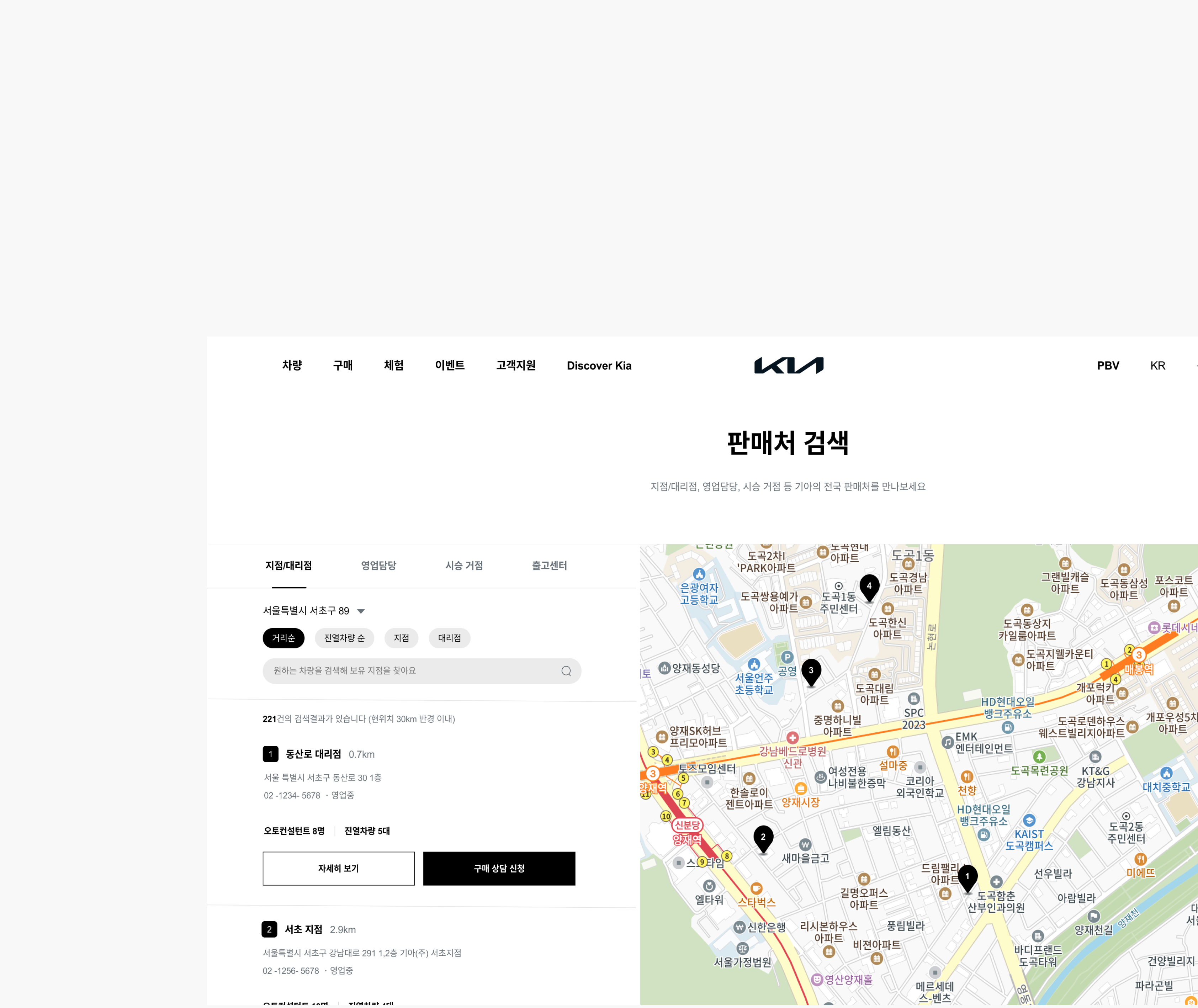
Problem Statement 1
Low discoverability of sales search
Usability testing revealed that several users struggled to complete a key task: finding a nearby sales location. Heatmap and click data confirmed frequent misclicks and navigation confusion, highlighting critical usability issues.
Problems:
- Misleading expectationsUsers clicked the “Purchase” button expecting to find sales locations. Since no such path existed, this caused confusion and drop-offs.
- Poor visual hierarchyThe sales search feature was buried at the bottom of the page, forcing unnecessary scrolling and reducing discoverability.
- Ambiguous labelingThe label “Sales Network” was unclear. Many users did not realize it referred to store locations, which delayed task completion
Solution 1
No More Getting Lost: Find Sales in One Tap
To improve entry into the sales search experience, we redesigned the interface based on observed usability issues.After implementation and testing, misclick rates dropped by 48.0%, showing that the new layout reduced user confusion and improved accessibility.
Solutions:
- Direct access from the “Purchase” buttonLinked sales search directly to the high-traffic “Purchase” button, removing unnecessary guesswork and aligning with user behavior.
- Clearer labels for better understandingReplaced the vague label “Sales Network” with the more familiar “Sales Search” to improve clarity and reduce hesitation.
- Reduced scrolling for faster accessRelocated the sales search feature higher on the page, eliminating endless scrolling and surfacing key actions at a glance.
Problem Statement 2
No immediate access to essential info
Usability testing revealed that users often struggled to access key vehicle and branch details, causing frustration and task delays.
Problems:
- No visibility of saved vehicle availabilityAfter saving a vehicle via the estimate feature, users could not easily see which branches had it in stock. They had to repeat searches and manually cross-check locations, leading to duplicated effort.
- Inefficient branch comparisonUsers had to click “View Details” for each branch individually to check availability, turning the selection process into a slow, repetitive experience.
- Key decision-making info hidden behind clicksImportant information, such as display vehicle availability and the number of consultants, was only revealed after additional clicks, preventing quick and informed comparisons.
Solution 2
Essential Info at a Glance: Smarter Filtering, Less Effort
To address user frustration with scattered and hidden vehicle availability data, I redesigned the branch search interface to surface key details upfront. In A/B testing, 92% of users preferred the new layout, citing greater clarity and reduced search effort.
Solutions:
- Integrated saved vehicle data into search resultsUsers can now instantly see which branches carry their saved vehicle after estimating—eliminating the need to repeat searches or manually compare locations
- Exposed key branch information without extra clicksPreviously hidden data like vehicle count and number of consultants is now visible at a glance, allowing faster, more informed decisions.
- Added filter options for faster matchingUsers can filter branches by region, branch type, and vehicle model—helping them narrow down the list quickly and reduce cognitive load.
Problem Statement 3
Lack of sales rep details prior to consultation
After usability testing, I addressed user feedback and identified three main issues
Problems:
- Only basic sales rep information providedUsers could only see distance, without enough details to judge whether a consultant was trustworthy or suitable for their car needs.
- Unclear order of sales representativesAlthough nearby consultants were listed, the sorting logic was unclear, leaving users confused about the order.
- No option to choose a preferred sales representativeEven if users found a consultant they liked, they were unable to request a consultation with them, which led to drop-offs and canceled inquiries.
Solution 3
Quickly Find and Consult a Trusted Sales Rep for Your Car
To address user frustration with the lack of trustworthy information about sales representatives prior to consultation, I redesigned the sales rep section to provide clearer details. In A/B testing, 85% of users preferred a tab-based layout with key characteristics and ratings over long text introductions, citing greater clarity and efficiency in evaluating consultants
Solutions:
- Tabs and star ratings to view sales rep characteristicsThe original screen only displayed basic information about sales reps. We replaced this with a tab-based layout and star reviews, giving users a faster, more structured way to understand each consultant’s strengths. This increased user confidence in selecting a trustworthy representative
- Trusted reps shown first by review orderInstead of unclear sorting, sales reps are now displayed by review ranking. This transparency made it easier for users to identify top-rated consultants, improving both clarity and trust
- Instantly request a consultation with your chosen sales repIntroduced a direct consultation request option on the same page, allowing users to immediately connect with their preferred consultant. This not only increased consultation requests but also supported stronger sales conversions..
Achievement
No More Getting Lost—Find Sales in One Tap
To improve entry into the sales search experience, we redesigned the interface based on observed usability issues. After implementation and testing, misclick rates dropped by 48.0%—indicating that the new layout helped reduce user confusion and improved accessibility.
Solutions:
- Connected sales search to the high-traffic “Purchase” button.
I linked the sales search directly to the “Purchase” button—removing unnecessary guesswork and aligning with user behavior. This change made access immediate and intuitive.
- Clearer labels improved task flow
I replaced the vague label “Sales Network” with the more familiar term “Sales Search,” improving user understanding and reducing hesitation during navigation.
- No more Endless scrolling
By relocating the sales search feature higher on the page, users no longer needed to scroll past unrelated content. Key actions became accessible at a glance.
What I learned
A/B testing is a step closer to usersThrough A/B testing, I learned to validate design decisions with evidence rather than assumptions. By comparing success rates across different layouts, I gained experience in measuring impact and using data-driven insights to guide iterative improvements.
Journey mapping is the key to understanding By creating journey maps, I learned to analyze the entire user flow instead of focusing on isolated screens. Mapping emotions alongside actions revealed hidden friction points and clarified opportunities, enabling me to design more intentional and human-centered solutions.
My Role
I led the full design process individually—from UX research and user testing to userflow, high-fidelity UI design, and interactive prototyping.
Prototype
Prototype Video
Previous Project
Fingoo
Next Project
Mingle
Email: soyeony@umich.edu
82 + 010 4657 2274
© Soyeon Yun 2025 All Rights Reserved
From Misclicks to Smooth Store Search
This project was a service planning initiative aimed at improving the sales location search experience on Kia’s website. It focused on resolving the unclear and inefficient user flow for finding sales locations, enhancing information satisfaction, and helping users reach the next step—requesting a purchase consultation—more quickly. Ultimately, the goal was to optimize the user journey to drive business benefits. This was a company task completed as part of the recruitment process.
Year
Company
2025
Hyundai Autoever
OS
Role
App, Web
Product Designer (100%)
Problem Findings
High Misclick Rate & Low Information Satisfaction in Sales Network Search
I conducted a prototype-based usability test with 8 users who had recently purchased or shown interest in cars, using Maze. I independently led the user research and surveys to identify usability issues in the sales network search experience.
The findings revealed two key problems:
- Users struggled to locate the sales network feature, resulting in a high rate of misclicks.
- Once inside the search flow, users were dissatisfied due to a lack of essential information.
These issues highlighted both navigation and information delivery problems, negatively impacting the overall user experience and service trust.
User Research
Users wanted to see key information they considered important when browsing sales locations.
To further investigate the usability issues uncovered during testing, I conducted surveys and analyzed Voice of Customer (VOC) data to better understand users’ needs, frustrations, and expectations during the sales network search experience.
The research revealed that users prioritize three main aspects when browsing sales locations:
- Accessibility: Easily locating the sales search feature
- Transparency: Clear and trustworthy information about sales representatives
- Efficiency: Immediate visibility of which dealerships have the desired vehicles
However, the current interface failed to deliver on these expectations, resulting in usability issues such as low discoverability, fragmented information, and user frustration.
User Need: Users want key information presented up front, without extra steps or clicks.Pain Point: Users struggle to find the sales network search and cannot easily access critical information they care about.
User Journey
Low Discoverability, Missing Info, and Broken Trust: Insights from the User Journey
Building on insights gathered from user research, I created a user journey map to visualize the end-to-end experience and uncover deeper insights into user behavior. This approach allowed me to identify specific pain points at each stage of the journey, helping to translate abstract frustrations into clearly defined UX challenges.
As a result, I identified three critical issues that negatively impacted the overall user experience:
Low discoverability of the sales network search feature
Lack of consolidated information—such as vehicle availability and salesperson details—at a glance
Insufficient transparency in salesperson information, which reduced user trust and confidence in taking further action
Design Goals & Strategy
Streamline sales network discovery and surface key information at a glance - enabling faster customer engagement and accelerating business impact.
Based on user research and journey mapping, we identified three critical pain points in the sales network experience:
- low visibility of the sales search feature,
- fragmented and hard-to-access information
- lack of trust due to missing salesperson details.
To address these, we explored UX ideas that would directly target each issue, such as repositioning key CTAs, enhancing filtering features, and creating concise info summaries.
We then unified these into a single design strategy:‘Streamline sales network discovery and surface key information at a glance to enable faster customer engagement and accelerate business impact.’
This strategy not only simplifies user flow but also empowers decision-making by delivering the most relevant information upfront.
Problem Statement 1
Low discoverability of sales search
Usability testing revealed that several users struggled to complete a key task: finding a nearby sales location. Heatmap and click data confirmed frequent misclicks and navigation confusion, highlighting critical usability issues.
Problems:
- Misleading expectationsUsers clicked the “Purchase” button expecting to find sales locations. Since no such path existed, this caused confusion and drop-offs.
- Poor visual hierarchyThe sales search feature was buried at the bottom of the page, forcing unnecessary scrolling and reducing discoverability.
- Ambiguous labelingThe label “Sales Network” was unclear. Many users did not realize it referred to store locations, which delayed task completion
Solution 1
No More Getting Lost: Find Sales in One Tap
To improve entry into the sales search experience, we redesigned the interface based on observed usability issues.After implementation and testing, misclick rates dropped by 48.0%, showing that the new layout reduced user confusion and improved accessibility.
Solutions:
- Direct access from the “Purchase” buttonLinked sales search directly to the high-traffic “Purchase” button, removing unnecessary guesswork and aligning with user behavior.
- Clearer labels for better understandingReplaced the vague label “Sales Network” with the more familiar “Sales Search” to improve clarity and reduce hesitation.
- Reduced scrolling for faster accessRelocated the sales search feature higher on the page, eliminating endless scrolling and surfacing key actions at a glance.
Problem Statement 2
No immediate access to essential info
Usability testing revealed that users often struggled to access key vehicle and branch details, causing frustration and task delays.
Problems:
- No visibility of saved vehicle availabilityAfter saving a vehicle via the estimate feature, users could not easily see which branches had it in stock. They had to repeat searches and manually cross-check locations, leading to duplicated effort.
- Inefficient branch comparisonUsers had to click “View Details” for each branch individually to check availability, turning the selection process into a slow, repetitive experience.
- Key decision-making info hidden behind clicksImportant information, such as display vehicle availability and the number of consultants, was only revealed after additional clicks, preventing quick and informed comparisons.
Solution 2
Essential Info at a Glance: Smarter Filtering, Less Effort
To address user frustration with scattered and hidden vehicle availability data, I redesigned the branch search interface to surface key details upfront. In A/B testing, 92% of users preferred the new layout, citing greater clarity and reduced search effort.
Solutions:
- Integrated saved vehicle data into search resultsUsers can now instantly see which branches carry their saved vehicle after estimating—eliminating the need to repeat searches or manually compare locations
- Exposed key branch information without extra clicksPreviously hidden data like vehicle count and number of consultants is now visible at a glance, allowing faster, more informed decisions.
- Added filter options for faster matchingUsers can filter branches by region, branch type, and vehicle model—helping them narrow down the list quickly and reduce cognitive load.
Soyeon Yun
UX/UI
Other Work
About
Problem Statement 3
Lack of sales rep details prior to consultation
After usability testing, I addressed user feedback and identified three main issues
Problems:
- Only basic sales rep information providedUsers could only see distance, without enough details to judge whether a consultant was trustworthy or suitable for their car needs.
- Unclear order of sales representativesAlthough nearby consultants were listed, the sorting logic was unclear, leaving users confused about the order.
- No option to choose a preferred sales representativeEven if users found a consultant they liked, they were unable to request a consultation with them, which led to drop-offs and canceled inquiries.
Solution 3
Quickly Find and Consult a Trusted Sales Rep for Your Car
To address user frustration with the lack of trustworthy information about sales representatives prior to consultation, I redesigned the sales rep section to provide clearer details. In A/B testing, 85% of users preferred a tab-based layout with key characteristics and ratings over long text introductions, citing greater clarity and efficiency in evaluating consultants
Solutions:
- Tabs and star ratings to view sales rep characteristicsThe original screen only displayed basic information about sales reps. We replaced this with a tab-based layout and star reviews, giving users a faster, more structured way to understand each consultant’s strengths. This increased user confidence in selecting a trustworthy representative
- Trusted reps shown first by review orderInstead of unclear sorting, sales reps are now displayed by review ranking. This transparency made it easier for users to identify top-rated consultants, improving both clarity and trust
- Instantly request a consultation with your chosen sales repIntroduced a direct consultation request option on the same page, allowing users to immediately connect with their preferred consultant. This not only increased consultation requests but also supported stronger sales conversions..
Achievement
Reduced misclick rate 48.0%p and increased info satisfaction
To improve entry into the sales search experience, we redesigned the interface based on observed usability issues. After implementation and testing, misclick rates dropped by 48.0%—indicating that the new layout helped reduce user confusion and improved accessibility.
Solutions:
- Connected sales search to the high-traffic “Purchase” button.
I linked the sales search directly to the “Purchase” button—removing unnecessary guesswork and aligning with user behavior. This change made access immediate and intuitive.
- Clearer labels improved task flow
I replaced the vague label “Sales Network” with the more familiar term “Sales Search,” improving user understanding and reducing hesitation during navigation.
- No more Endless scrolling
By relocating the sales search feature higher on the page, users no longer needed to scroll past unrelated content. Key actions became accessible at a glance.
What I learned
A/B testing is a step closer to usersThrough A/B testing, I learned to validate design decisions with evidence rather than assumptions. By comparing success rates across different layouts, I gained experience in measuring impact and using data-driven insights to guide iterative improvements.
Journey mapping is the key to understanding By creating journey maps, I learned to analyze the entire user flow instead of focusing on isolated screens. Mapping emotions alongside actions revealed hidden friction points and clarified opportunities, enabling me to design more intentional and human-centered solutions.
My Role
I led the full design process individually—from UX research and user testing to userflow, high-fidelity UI design, and interactive prototyping.
Prototype
Prototype Video
Previous Project
Fingoo
Next Project
Mingle
Email: soyeony@umich.edu
82 + 010 4657 2274
© Soyeon Yun 2025 All Rights Reserved